Background
Visual ethics and emotional appeal have been raised as important issues in contemporary discussions on data display. In the early 21st century, Dragga and Voss (2001) “expanded the definition of visual ethics.” while most of the modernists tried to define visual ethics as the avoidance of the “lie factor” (Tufte, 2001) and allow audiences to perceive numbers accurately, they indicated that visual ethics should also save more rooms for humanity: using mere numbers and geometrical shapes to display the death or tragedy of events can be unethical because they shouldn’t be reduced to pure neutral facts. Moreover, while the prevailing empirical research used robust experiments to examine the perception of different types of charts (Heer & Bostock, 2010; Cleveland & McGill, 1984; MacDonald-Ross, 1977), emotion is also raised as a focal point in the discussion of data display, especially comes to the digital age (Kostelnick, 2016). Although the “perceptual cognitive-based school” (Brasseur, 2003) has raised the concepts like “data-ink”, “data density”, or “chartjunk”, the digital age has “rapidly departed from its stark functionalism.” (p.122) By using pictorial charts, vivid elements, and “hyperbole cleverly embedding people, buildings, landscapes, and other objects into line, bar, and pie charts”, emotions are more and more common in visual data display today.
According to Campbell and Offenhuber (2019), the proximity between audiences and the data impacts the emotion of data visualization, especially the temporal proximity (p. 83). Human form in data display has a high level of proximity, and it can express a wide range of emotions: “Emotion infuses the rhetoric of human forms, however explicitly or subtly expressed in a given figure or scene.” (Kostelnick, 2019, p. 211)
The re-emergence of emotion in data visualization can be reflected in various communication scenes, including scientific journals, in which technical communication has been theorized to explore how illustration, graphics, and charts can be persuasive (Welhausen, 2017, p. 83). However, it seems that the emotion of data display in scientific journals has not been explored. Furthermore, since scientific journals inevitably use pictures of human beings, including animals, the visual ethics of the data display has not been discussed yet.
This paper chooses a prevailing experimental animal, the rat, as the research topic. Mice and rats are the most common animals in scientific research, including biomedical, psychology, and engineering, among others (Hickman et al., 2016). The usage of rats as standard experimental animals was set in 1914, and its picture has been used in scientific journals among various subjects. To study the illustrations of the rat in data display, this paper will explore how the rat has formed conventional codes in scientific journals and how the conventional codes define or reflect the science discourse in academic communities.
The History of Rats as Laboratory Animal
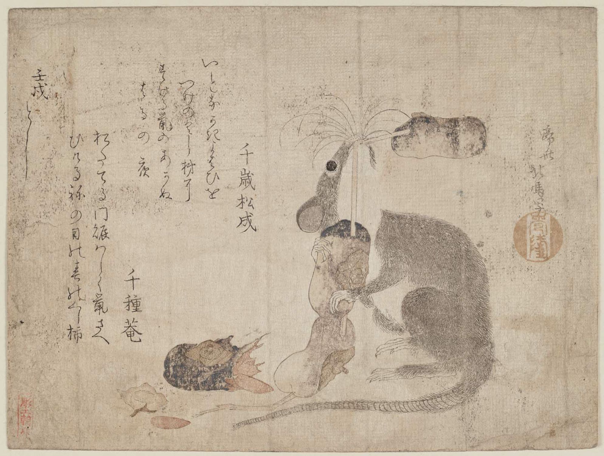
The rat as a kind of animal that was bred as a pet can be traced back to 1654 (Baker et al., 2013, p. 74); in a Japanese guidebook, Chinganso Dategusa, the breeding of “Daikoku-Nezumi” was shown (See the Figure 1)[1]. In this illustration, the different kinds of rats were named and distinguished in Japan. Since the 19th century, Albino mutants were brought into laboratories for early physiologic studies. In 1914, Henry H. Donaldson started the standardization of the laboratory rat.
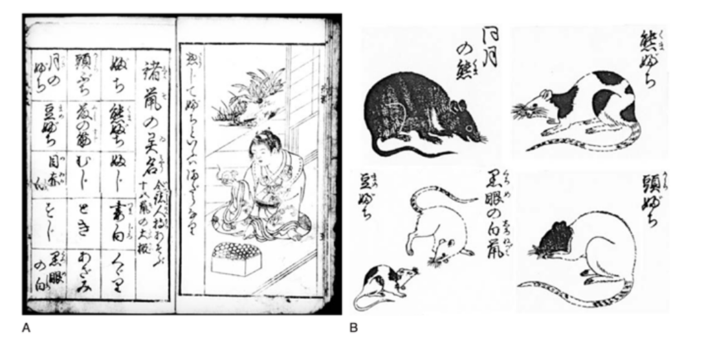
Figure 1.
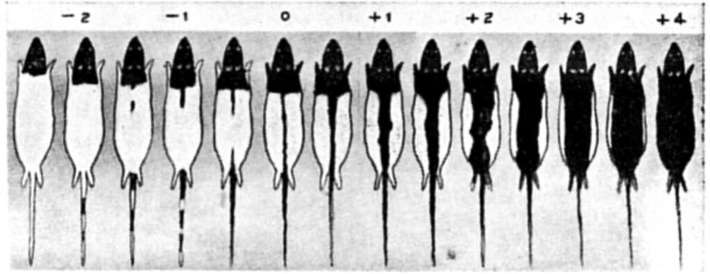
Figure 2. From A Critique of the Theory of Evolution, by Thomas Hunt Morgan, 1916
In 1914, Castle and Phillips worked on the understanding of coat color inheritance in rats (Morgan, 1916). Between 1907 and 1919, over 50,000 rats were involved to address the genetic problem of the hooded pattern. As an explanation for his theory, the grading scale for the hooded rats has been made to be persuasive for the audiences to understand how the specific inherit character is shown in rats. In this data display, the pattern of the coated rats was described carefully and precisely as a kind of data. This was the first time scientists used rats’ illustrations in scientific explanation, rigorously building the rat’s picture as a genre.
Since then, rats have become the most commonly used animals for scientific research. The major reason is the similar physiological structure shared by humans and rats; this feature was also explained as an anatomical illustration (Figure 3), in which the cardiovascular systems were displayed, marking the areas usually used in scientific research. In this way, the ethos of using rats in scientific research has been reinforced by using rat illustration, which entails the scientific discourse in the 20th century.
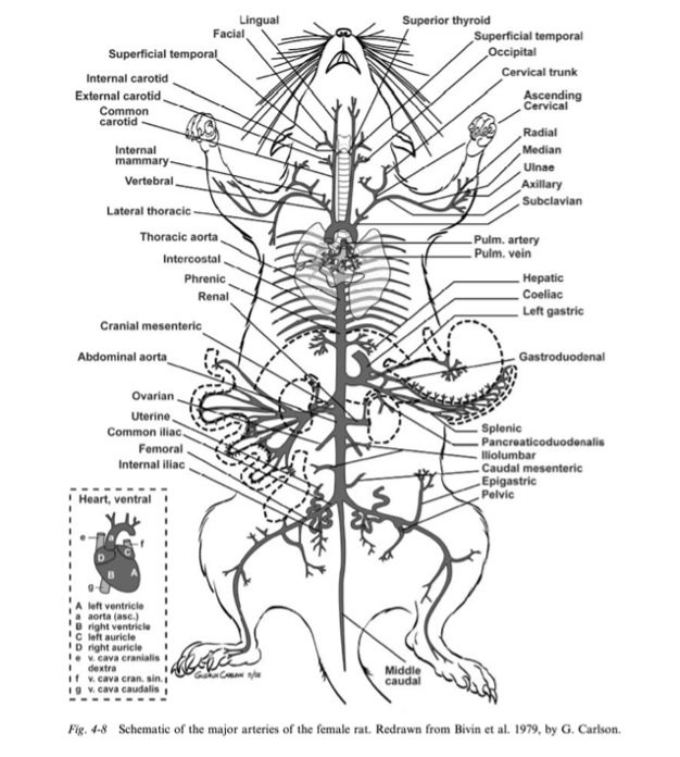
Figure 3
Since then, rats have become the most commonly used animals for scientific research. the major reason is the similar physiological structure shared by humans and rats; this feature was also explained as an anatomical illustration (Figure 3), in which the cardiovascular systems were displayed, marking the areas usually used in scientific research. In this way, the ethos of using rats in scientific research has been reinforced by using rat illustration, which entails the scientific discourse in the 20th century.
Genre Conventions of Rats and Emotional Appeals in 20th Century
In the history of data visualization, after the golden age from 1860 to 1890, the first half of the 20th century is called the “Modern Dark Age,” according to Friendly and Wainer (2021). Friendly explained, “But more importantly, a new zeitgeist began to appear, which would turn the attention and enthusiasm of both theoretical and applied statisticians away from graphic displays, back to numbers and tables, with a rise of quantification that would supplant visualization.” (Friendly & Wainer, 2021, p. 182). Following this zeitgeist, as this paper mentioned before, the studies of statistical data display mainly discussed the accurate perception of numbers in different kinds of charts, using experimental and empirical research.
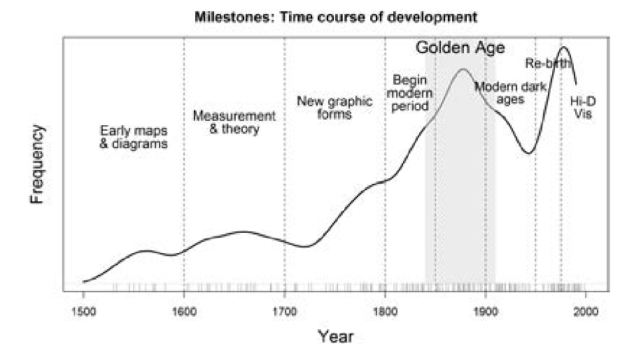
Figure 4
Even if the tables and numbers were dominant in the first half of the 20th century, the representation of rats is inevitably figurative. Looking back to the grading scale of hooded rats in 1961, the appearance of rats was depicted in detail since the coated shapes are the data themselves. Yet, embodied the zeitgeist in journals in natural science, it seems that most of them simply got rid of the representation of the rats themselves: I searched the keywords “rat”, in the first half of the 20th century on the website of science, I found no illustration in nearly all the journals, even the more “serious” types like bar charts and line graphs are rare.
There is very little room for emotions in data visualization during this period, even in the second half of the 20thcentury, during which we can see a “rebirth” in Friendly’s Milestone Timeline (Figure 4). The genre of the rat representation in data display in the second half of the 20th century is largely recurrent and figural, which shows the identification of rats (Figure 5), the characteristics of rats (Figure 6), etc. The shapes, volume, and actions are depicted in a realistic way to show the data in a way that excludes emotional appeals, trying to make the scientific data objective.
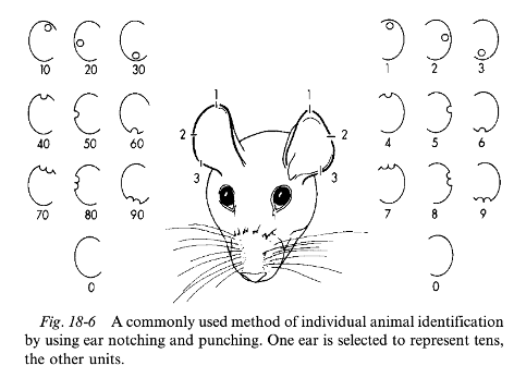
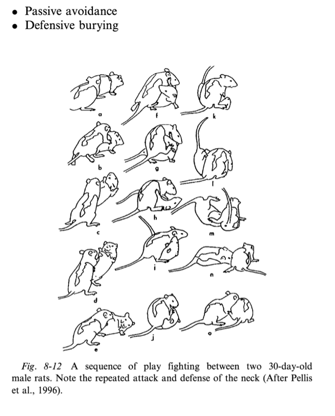
Up: Figure 5 Down: Figure 6
Visual Ethics of Rats in 20th Century
The ethics of animal use in experiments is a complicated and in-debate topic discussed by scholars, especially using rats. When the rats had become prevailing in experiments by the beginning of the 18th century, the concerns of widely abuse of animals grew. The literary men, including Rousseau, Primatt, and Jeremy Bentham, were strongly against the abuse of animals: they argued that animals also had the ability to experience feeling, such as pleasure and suffering (Hubrecht, 2014, p. 10). Yet, the majority of people at that time were still not concerned about the well-being of experimental animals; this attitude can be found in the painting of Joseph Wright: An Experiment on a Bird (Figure 7).

Figure 7
Similarly, these unempathetic attitudes toward experimental rats are reflected in the data display of rats. During the 20th century, the guidance of using rats in different experiments was common in scholarly discussion: the illustration shows the details of the restraints and control of the rats without considering the emotion and the ethics of using the rats too much.
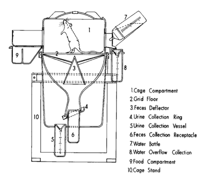
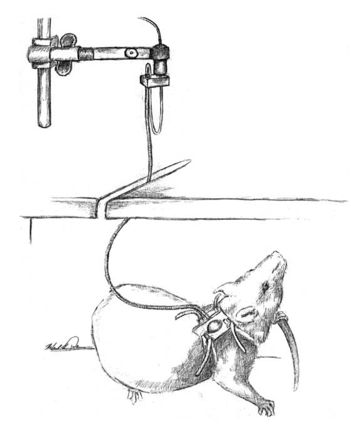
Up: Figure 8, Down: Figure 9
Emotional Appeals in Contemporary Data Display of Rats
Entering the 21st century, digital devices and techniques save more room for emotional appeals (Kostelnick, 2016); visual embellishment was also raised in the discussion of “chartjunk,” and the pictorial elements in data visualization seem to embody humanity (Dragga & Voss, 2001).
In today’s “serious” natural science discussion, there seems to be more room for emotions in data visual display. In Fang et al.’s (2014) research in 2014, the autism-like behaviors changed because the injection of XAV939 was depicted in a genre of comics: the facial expression and the speech balloon were used in the illustration, giving an intriguing expression of emotional appeal to the scientific explanation (Figure 10).
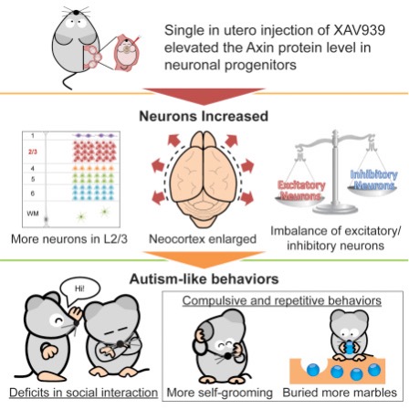
Figure 10
Furthermore, the aesthetic aspects are also considered in the visual data display today. In an article about cancer treatment, the color code pink was used for aesthetic and emotional appealing purposes; there are also smiles on the face of the rat, entailing an upbeat mood in the illustration. These elements could be defined as “chartjunk” or low data-ink ratio. However, the emotional and ethical considerations may make them stand out, entailing humanity in natural science today.

Figure 11
Note
[1] Most historical figures are selected from the book, The Laboratory Rat: Biology and Diseases by Baker et. al.
References
Baker, H. J., Lindsey, J. R., & Wesibroth, S. H. (2013). The Laboratory Rat: Biology and Diseases. Elsevier.
Brasseur, L. E. (2003). Visualizing Technical Information: A Cultural Critique. Baywood Pub.
Campbell, S., & Offenhuber, D. (2019). Feeling numbers: The emotional impact of proximity techniques in visualization. Information Design Journal, 25(1), 71–86. https://doi.org/10.1075/idj.25.1.06cam
Cleveland, W. S., & McGill, R. (1984). Graphical Perception: Theory, Experimentation, and Application to the Development of Graphical Methods. Journal of the American Statistical Association, 79(387), 531–554. https://doi.org/10.1080/01621459.1984.10478080
Dragga, S., & Voss, D. (2001). Cruel Pies: The Inhumanity of Technical Illustrations. Technical Communication, 48(3), 265–274.
Fang, W.-Q., Chen, W.-W., Jiang, L., Liu, K., Yung, W.-H., Fu, A. K. Y., & Ip, N. Y. (2014). Overproduction of upper-layer neurons in the neocortex leads to autism-like features in mice. Cell Reports, 9(5), 1635–1643. https://doi.org/10.1016/j.celrep.2014.11.003
Friendly, M., & Wainer, H. (2021). A History of Data Visualization and Graphic Communication. Harvard University Press.
Heer, J., & Bostock, M. (2010). Crowdsourcing graphical perception: Using mechanical turk to assess visualization design. 203–212. https://doi.org/10.1145/1753326.1753357
Hickman, D. L., Johnson, J., Vemulapalli, T. H., Crisler, J. R., & Shepherd, R. (2016). Commonly Used Animal Models. Principles of Animal Research for Graduate and Undergraduate Students, 117. https://doi.org/10.1016/B978-0-12-802151-4.00007-4
Hubrecht, R. C. (2014). The Welfare of Animals Used in Research: Practice and Ethics. John Wiley & Sons.
Kostelnick, C. (2016). The Re-Emergence of Emotional Appeals in Interactive Data Visualization. Technical Communication, 63(2), 116–135.
Kostelnick, C. (2019). Humanizing Visual Design: The Rhetoric of Human Forms in Practical Communication (1st edition). Routledge.
MacDonald-Ross, M. (1977). How Numbers Are Shown: A Review of Research on the Presentation of Quantitative Data in Texts. AV Communication Review, 25(4), 359–409. https://doi.org/10.1007/BF02769746
Morgan, T. (1916). A Critique Of The Theory Of Evolution. http://archive.org/details/in.ernet.dli.2015.88505
Tufte, E. R. (2001). The Visual Display of Quantitative Information. Graphics Press.
Welhausen, C. A. (2017). Visualizing Science: Using Grounded Theory to Critically Evaluate Data Visualizations. In Scientific Communication. Routledge.
Leave a Reply